See below for my Web design work.
Governance Alive
The Brief:
This assignment focused on using an existing website and updating the layout based on heuristic evaluations, user research, and observation-based user testing. After completing the background research, we were tasked with creating a high-fidelity prototype that contained actual content from the current site.
The Background:
Our professor had an existing relationship to the company and we were able to understand their goals and desired outcomes of updating their website. We were assigned to work in teams of four, and the work was done over the course of a semester. Each team member did all of their own background research and low-fidelity prototypes, that was used to collaborate on the final product seen above.
The Plan (The graphic above is interactive - feel free to click around!):
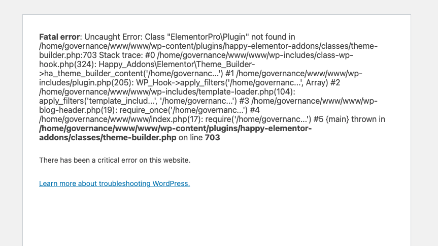
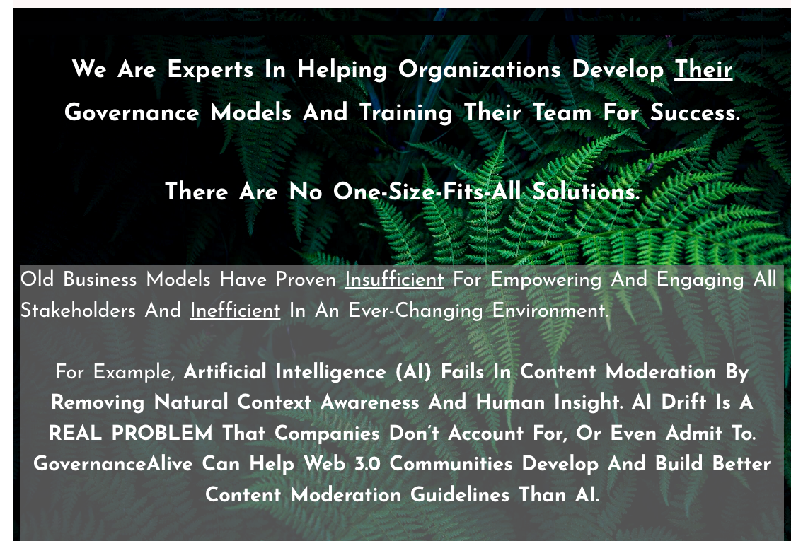
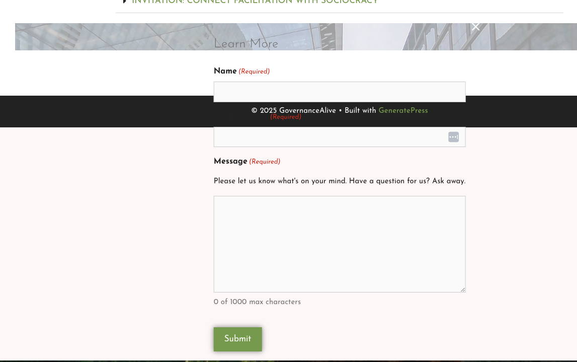
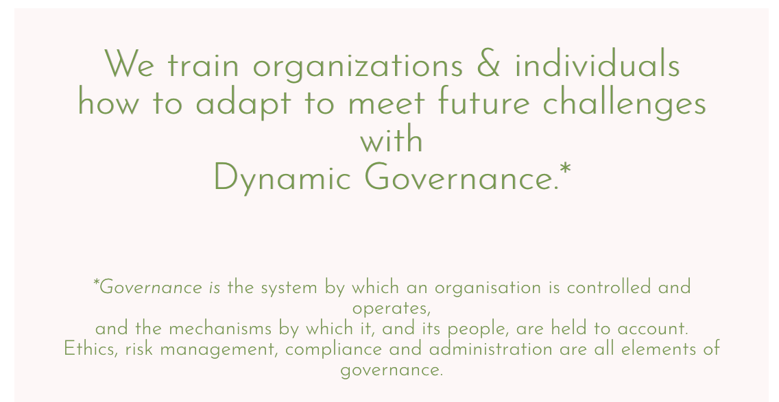
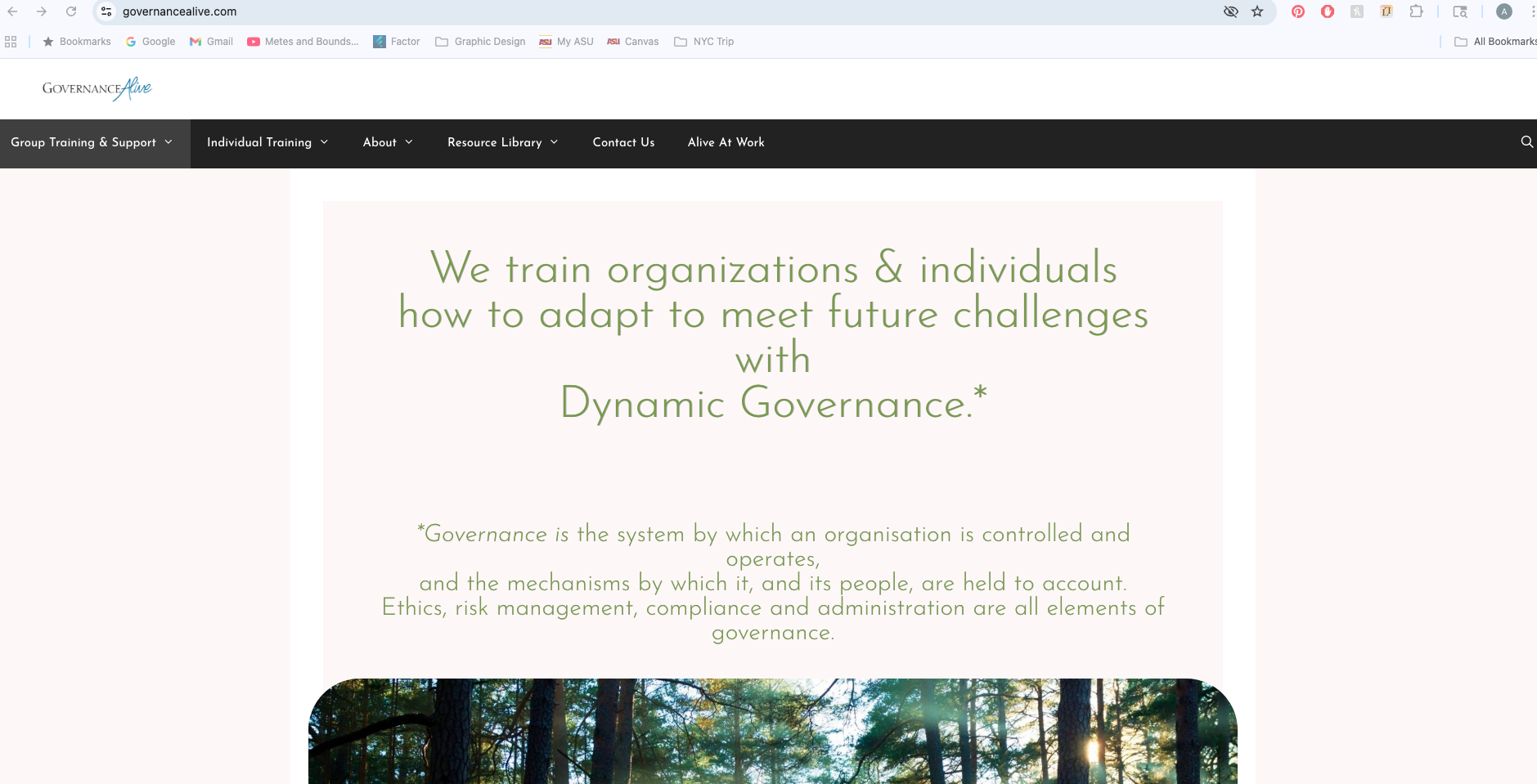
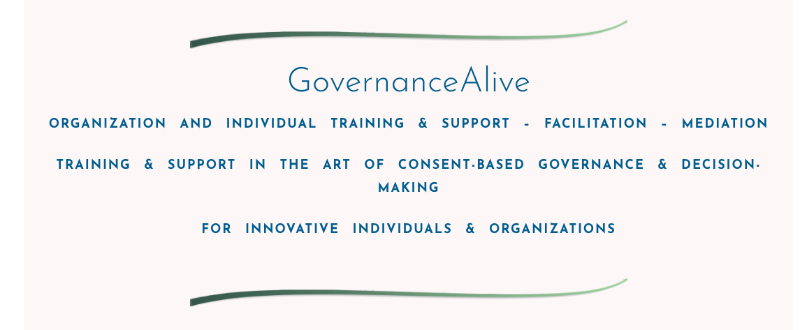
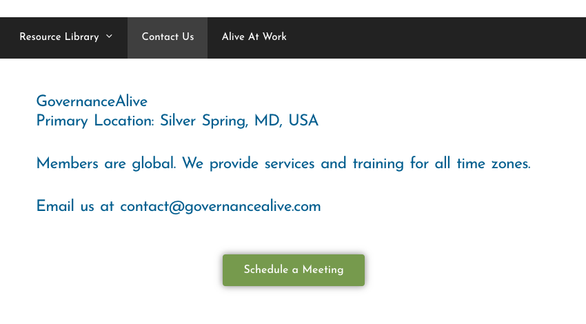
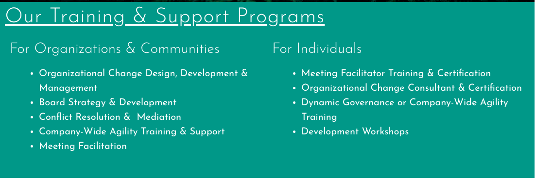
This company’s website had numerous issues in accessibility, layout, organization, and at times, usability. Research uncovered that most people who visited the site without knowing what the site was ahead of time, were very confused about the point of the site, and how it functioned. In terms of accessibility, the text wasn’t always legible or had enough contrast, and paragraphs of text would be in all caps. The search function didn’t work, and trying to schedule certain appointments brought up error messages. The navigation and hierarchy were difficult to understand and sort through. To solve these issues, we redesigned the website using our observation-based user testing and accessibility guidelines to simplify and clarify the message.
See below for screenshots of the original site.

Mood
The Brief:
For this assignment, we were tasked with creating a high-fidelity app for a concert venue with three locations so that users could purchase tickets to events at all three locations from a single app.
The Background:
Each venue had specific requirements such as hours, age range, genres, and days of operation. For the app, there were three main features to design. The first was an event list/calendar of events that showed all the events happening at all the venues, filtering options, and ability to interact with specific events. The second feature was a user account that showed how a user would sign up for an account, an error screen if the user did not input all the required information, links to personal info, payment info, and ticket pages. The third feature was to purchase a ticket that showed how a user would add a ticket to their cart, how many tickets the user could purchase, checkout information, terms and conditions, and a virtual ticket.
The Plan (The graphic above is interactive - feel free to click around!):
The app above shows the Home page with a list of upcoming concerts and venues in chronological order. The calendar button shows all the upcoming events color coded by venue and the ability to filter through genre or location. The My Account button takes you to a login page and shows the process of creating an account. The My Events button takes you to your upcoming and past events and allows you to click on your ticket to see the info. If you were to click on an event from the calendar, the app would guide you through the checkout process for an upcoming event.